Your homepage hero has one job: tell a visitor what this is, who it’s for, and what to do next, all before they’ve finished their first scroll. The single rule that matters more than any layout trick is this: write the headline and CTA in plain text before you touch a design tool, since a beautiful hero with a vague message still fails. What follows covers the anatomy, seven proven layout patterns, copy formulas, visual and performance rules, responsive behaviour, and a launch checklist you can run today.
- The headline should be concise and outcome-focused, with a subhead clarifying the target audience or how it works, avoiding repetition.
- Choose a single layout pattern, such as split screen or product showcase, to effectively frame your message without blending multiple styles.
- Use real, optimised visuals like actual screenshots or authentic photos sized at 1920 × 1080 pixels to build trust and avoid slow load times.
- Test your hero with a five-second test before launching, ensuring one clear primary CTA, good contrast, keyboard accessibility, and mobile responsiveness.
- Prioritise message-first design, measuring metrics like click-through rate, scroll depth, and load speed post-launch to optimise conversions over time.
Table of Contents
- What Goes Into A Homepage Hero Design?
- Which Hero Layout Pattern Fits Your Site?
- How Do You Write A Headline That Converts?
- Should You Use A Photo, Screenshot Or Video In The Hero?
- Does The “Fold” Still Matter On Mobile?
- What Should You Check Before Launching A Hero?
- How Does An Agency Actually Build A Hero That Works?
- How Do You Make A Hero Accessible To Every Visitor?
- How Do You Optimise A Hero For Search, Not Just Conversions?
- How Do You Design A Hero That Speaks To A Broad Audience?
- The One Priority Worth Remembering
- How TTOY Digital Builds Heroes That Actually Convert
- Sources
- FAQ
What Goes Into A Homepage Hero Design?
Every effective hero rests on the same skeleton, whatever industry you’re designing for. Strip away the visual polish and you’re left with a handful of components, each doing one specific job. Get the anatomy right and the layout becomes a much easier decision.
The headline is a single-sentence outcome, not a description of your company. Aim for under eight words where you can manage it; anything longer starts competing with itself for attention. The subhead exists to clarify, not repeat. If your headline says what you do, the subhead should explain who it’s for or how it works, never restate the same idea in different words.
Then there’s the primary CTA, the one action you actually want someone to take. A hero should contain at minimum a headline, a subhead and one primary call to action; AIDesigner’s breakdown of hero anatomy treats this trio as the non-negotiable core. Everything else is optional dressing:
- An eyebrow or category tag that sets context before the headline lands
- Social proof, such as client logos or a star rating, placed where it’s glanced at rather than studied
- A secondary CTA, visually smaller and less saturated than the primary
- A supporting visual, whether that’s a photo, screenshot or short clip
Reading flow matters here too. Hero layouts generally follow an F-pattern or Z-pattern, so headline placement and CTA position should sit where the eye naturally lands first, according to SERP Blocks’ hero design guidance.
Which Hero Layout Pattern Fits Your Site?
Seven layout patterns cover almost every effective homepage hero you’ll encounter, and picking one skeleton and sticking to it beats trying to blend three. Here’s how to choose.
- Centred stack. Headline, subhead and CTA stacked in the middle, often with a subtle background. Best for simple offers with one clear message; the risk is that it can feel static without strong typography. Collapses cleanly on mobile since it’s already vertical.
- Split screen. Text on one side, visual on the other, typically following a Z-pattern reading flow. Works well for products you can actually show. On mobile, stack text first, then the visual underneath, never the reverse.
- Full-bleed background. A photo or video fills the entire viewport with text overlaid. Striking for hospitality, travel or lifestyle brands, but risks poor text contrast if you don’t control the overlay carefully.
- Product showcase. A large screenshot or mockup dominates, useful for software where seeing the interface builds instant credibility. Needs a real, current screenshot, not a stock illustration.
- Typographic. Oversised type carries the whole hero with minimal or no imagery. Suits confident, editorial-style brands; the risk is looking unfinished if the type choice is weak.
- Social-proof-led. Logos, ratings or a short testimonial sit directly in the fold. Effective in crowded categories where trust is the barrier, since AIDesigner notes that trust signals above the fold answer “why should I believe you” fast.
- Form-in-hero. A short signup or quote form sits beside the message. Best for lead-generation sites where the conversion event is the hero. Avoid more than three fields, or mobile users will abandon it.
One caution across all seven: avoid rotating carousel sliders in the primary hero space. They tend to reduce clarity and conversions compared with committing to one strong message, per ogBlocks’ hero best practices.
How Do You Write A Headline That Converts?
A reliable headline formula covers three things: who it’s for, the problem you solve, and the outcome they get. Try filling in this template: “[Outcome] for [audience] who [problem].” For example, “Mobile-first websites for small businesses tired of losing enquiries.” It’s not clever copywriting, but it’s clear, and clear beats clever nine times out of ten in a hero.
Designing the message first, before any visual work begins, is the workflow Orbix Studio recommends for SaaS and service sites alike, and it applies just as well to a local plumber’s homepage as it does to a software product.
Subhead rules are simpler than most people think:
- Add one specific, quantifiable, or contextual detail the headline didn’t cover
- Never repeat a phrase from the headline in different words
- Keep it to one sentence; two sentences means you haven’t decided what matters most
CTA hierarchy follows the same discipline. One primary CTA, visually dominant through colour and size; one secondary CTA at most, smaller and lower contrast. Label buttons with the action and the benefit where you can (“Get your free quote” beats “Submit”), and keep microcopy underneath the button honest (“No card required” only if that’s actually true). Our own notes on improving conversion rate go deeper on CTA wording if you want more examples, and Babylovegrowth’s guide to CTA importance is worth a read for button-level detail.
Pro Tip: Draft your headline, subhead and CTA copy in a plain text document before opening Figma. If the message doesn’t work as three lines of text on a blank page, no amount of layout will save it.
Should You Use A Photo, Screenshot Or Video In The Hero?
The right visual depends entirely on what you’re selling. For software or a web app, a real screenshot of the actual interface builds more trust than any stock photograph ever will, because it shows rather than tells. For service businesses, that same logic holds: HubSpot’s guidance on hero images warns against generic stock photography for B2B or service offers, favouring real photography or product shots that give visitors something tangible to judge you by.
On sizing, a safe desktop baseline is the common standard resolution of 1920 × 1080 pixels at a 16:9 aspect ratio, which keeps images sharp on modern displays without ballooning file size, according to the University of Maryland’s web image specifications cheat sheet.
Statistic Callout: Set your hero image at the common standard desktop baseline size of 1920 × 1080 pixels with a 16:9 aspect ratio, then serve smaller crops through a responsive
srcsetfor phones and tablets.
Beyond sizing, a few performance habits protect your load speed:
- Compress every hero asset and serve modern formats like WebP or AVIF where the browser supports it
- Avoid autoplay video that’s heavy or unoptimised; a short, compressed loop works, a full-resolution clip does not
- Lazy-load anything below the hero itself, since the hero visual is usually your Largest Contentful Paint element
Our guide to mobile image practices covers the responsive side of this in more depth. Poorly optimised hero assets are one of the most common causes of weak LCP scores and higher bounce rates, as ogBlocks documents.
Does The “Fold” Still Matter On Mobile?
The fold is fluid now, not a fixed line you design against. Above-the-fold content still shapes first impressions, but the smarter approach is designing the hero to encourage scrolling rather than cramming everything into a single screen height, as CXL argues. Leaving a visible sliver of the next section peeking into view is a cheap, effective scroll cue.
That said, a few mobile-specific rules keep heroes working at common breakpoints:
- Test your hero at 375px width, the rough baseline for most phones, before calling any layout finished
- For split-screen patterns, stack text above the visual on mobile; text always comes first
- Crop or swap out large background visuals on small screens rather than shrinking them, since preserving the message and CTA matters more than preserving the exact image
- Avoid oversised vertical hero heights that push the CTA below the initial viewport
- Increase line height and reduce headline size proportionally so type stays legible at arm’s length
Responsive hero design is really about protecting the message across every screen size, which sometimes means hiding or replacing a visual entirely on mobile rather than just scaling it down. Our piece on responsive web design walks through breakpoint strategy in more detail.
What Should You Check Before Launching A Hero?
A short pre-launch pass catches most hero mistakes before they cost you conversions.
- Run the five-second test: show the hero to someone unfamiliar with the project and ask what the site does. If they can’t answer in five seconds, the headline needs work.
- Confirm there’s one dominant CTA, not two competing buttons of equal visual weight.
- Check colour contrast and keyboard accessibility on every interactive element.
- Measure Largest Contentful Paint and fix anything pushing it past a comfortable threshold.
- View the hero at 375px and at a standard desktop width before calling it done.
Once it’s live, prioritise these A/B tests in order: headline wording first, since it moves the needle most; then CTA label and colour; then image versus screenshot; then social proof placement. Track click-through rate on the CTA, scroll depth past the hero, actual conversion events, and LCP, since a fast hero that nobody clicks and a slow hero that converts well are both problems worth catching early.
How Does An Agency Actually Build A Hero That Works?
At TTOY Digital, we run every hero project through the same message-first sequence, because skipping straight to visuals is where most homepage redesigns go wrong. The headline and CTA get written in plain text first, then checked with a five-second test on someone outside the project.
From there:
- We prototype two hero variants rather than committing to one design blind
- Both get a quick usability pass at 375px and on desktop before either goes live
- We measure LCP and CTA click-through once the page is public, not just at handover
How Do You Make A Hero Accessible To Every Visitor?
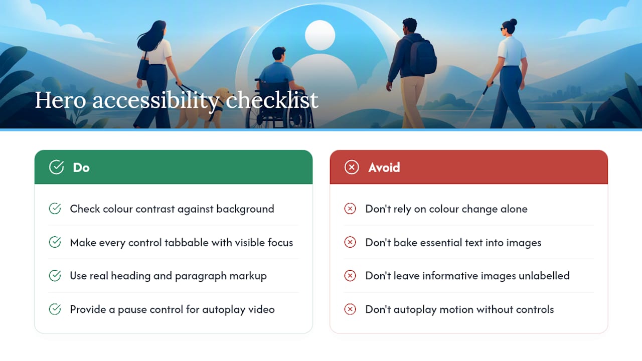
Accessibility in the hero isn’t a bolt-on task for the end of the project; it shapes decisions you make from the first draft. Colour contrast is the most common failure point. Your headline and CTA text need to hold sufficient contrast against whatever background sits behind them, including a background photo or video, which is exactly why full-bleed heroes carry the highest risk of failing contrast checks.
Keyboard navigation matters just as much, even in a section most people interact with by mouse or touch. Every interactive element in the hero, the primary CTA, any secondary CTA, a video play/pause control if you’ve included one, needs to be reachable and operable using the Tab key alone, with a visible focus state that doesn’t rely on colour change alone to signal it’s selected.
Screen reader support means your headline and subhead should sit in real heading and paragraph markup, not baked into an image or rendered purely through decorative CSS. If your hero visual is purely decorative, mark it so screen readers skip past it; if it’s a product screenshot conveying real information, it needs meaningful alt text describing what’s actually shown.
Autoplay video deserves particular care. Motion that starts without consent can be disorienting for visitors with vestibular disorders, so give any autoplaying hero video a visible pause control, and consider whether the motion is necessary at all versus a static frame with a play button.
None of this slows down design work meaningfully. It simply means testing your hero with a keyboard alone, and running a contrast checker against your actual background, before you consider the section finished.
How Do You Optimise A Hero For Search, Not Just Conversions?
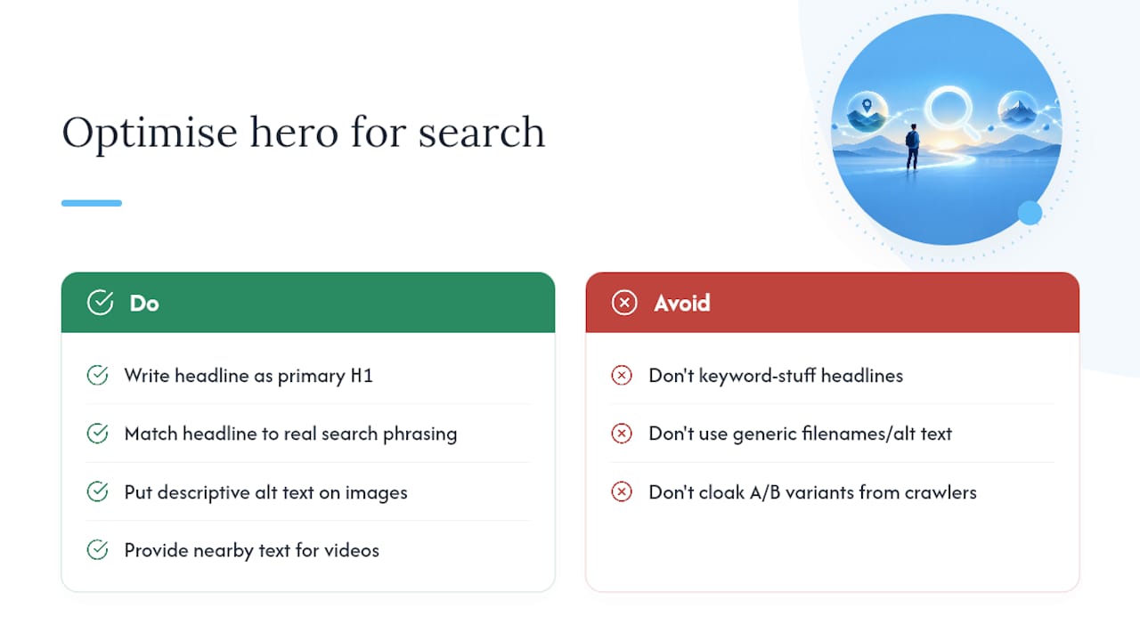
Your homepage hero carries real SEO weight because it’s usually the first substantial text Google’s crawlers encounter on your most important page. Treat the headline as more than a conversion line; it’s also a strong candidate for your primary H1, so the words you’d want to rank for and the words that convert need to overlap wherever that’s honestly possible.
That doesn’t mean stuffing keywords into a headline that should read naturally. It means choosing headline phrasing that reflects how real people search for what you offer, then trusting the subhead and body copy further down the page to carry supporting terms and detail. A headline forced to serve search intent and human clarity equally well beats one optimised purely for either.
Image files deserve the same attention. Hero images should carry descriptive, specific alt text (not “hero-image-final.jpg”) and be compressed enough that they don’t drag down page speed, since Google factors load performance into ranking signals. Filenames, alt attributes and file size all play a small part, but they compound across a whole site.
If your hero includes a video, make sure there’s a text alternative nearby, whether that’s the subhead or a short caption, since crawlers can’t parse video content the way they parse text. And if you’re running any A/B tests on hero headlines, keep both variants crawlable and avoid cloaking content shown to bots versus visitors, which search engines penalise heavily. Our team’s SEO service folds this kind of on-page optimisation into ongoing work rather than treating it as a one-off audit.
How Do You Design A Hero That Speaks To A Broad Audience?
A hero designed for one narrow customer profile quietly excludes everyone who doesn’t fit it, often without the designer noticing. Photography choices matter here more than most teams expect: if your hero image shows people, consider whether the range of ages, ethnicities and body types shown actually reflects your real customer base, rather than defaulting to whatever stock category felt convenient.
Language choices carry similar weight. Headlines built around aggressive, competitive framing (“Dominate your market”) land differently across cultures and personalities than calmer, outcome-focused language (“Get more of the right enquiries”). Neither is universally correct, but it’s worth asking who your current headline might be quietly alienating.
Practical accommodations help too. Avoid relying purely on colour to signal meaning in hero graphics or icons, since colour-blind visitors and low-vision users need a second cue, whether that’s shape, label or pattern. Keep animation subtle and optional where you can, since not every visitor processes motion the same way, and give text enough breathing room that visitors using browser zoom or larger default font sizes don’t see your carefully balanced layout collapse.
None of this means designing a bland, lowest-common-denominator hero. It means testing your strongest layout ideas against a wider set of real visitors than the team that built it, and treating any exclusion you find as something to fix rather than an edge case to ignore.
The One Priority Worth Remembering
If you take one thing from all this, commit to message-first hero design and stop treating copy as an afterthought to layout. Run the five-second test on someone who’s never seen the project, then measure what actually happens once it’s live, not what you assume will happen.
— Chris
How TTOY Digital Builds Heroes That Actually Convert
There are other routes here: hire a freelancer, use a template builder, or muddle through it yourself with a weekend and a lot of patience. TTOY Digital offers services aimed at building mobile-first heroes for small businesses, focusing on efficient delivery and clear engagements.
Our web design service covers exactly the workflow this article describes: message-first copy, a hero built and tested across breakpoints, and ongoing conversion optimisation once it’s live. Where lead capture matters, we connect the hero’s CTA straight into SmartFlowCRM, so a form submission or WhatsApp enquiry lands in one place instead of scattered across inboxes. Plans start with Starter at £120 per month, running up to Smart at £560 per month for larger builds, all detailed on our web design services page. If your current hero isn’t pulling its weight, that’s where to start.
Sources
- Web image specifications cheat sheet, University of Maryland
- Website hero section: anatomy, patterns, examples, AIDesigner
- SaaS hero section design: examples, formulas & tips, Orbix Studio
FAQ
What Is A Hero In Web Page Design?
A hero is the large, prominent section at the top of a webpage, usually the first thing a visitor sees. It typically combines a headline, subhead, one primary call to action and often a supporting visual to establish what the page offers within seconds.
What Is The Best Example Of A Homepage Hero Design?
There’s no single best example, since the right pattern depends on what you’re selling. A software product often performs best with a product showcase hero using a real screenshot, while a service business tends to do better with a split-screen or centred stack built around a clear, specific headline.
Are Hero Images Still Relevant In Homepage Design?
Yes, but the image needs to earn its place rather than exist for decoration. Real screenshots or authentic photography outperform generic stock imagery for service and software sites, and a safe desktop baseline of 1920 × 1080 pixels at 16:9 keeps that image sharp without slowing the page down.
How Do You Build An Effective Hero Section?
Write the headline, subhead and primary CTA in plain text before any visual design begins, then choose one of the seven proven layout patterns rather than mixing several. Test the result with a five-second test on someone unfamiliar with the project, then measure click-through rate and LCP once it’s live, adjusting from there. TTOY Digital’s web design service follows this exact sequence for small business clients who’d rather have it handled properly from the start.
Recommended
- What does a good small business website look like?
- Paid Discovery First: Choose a Web Design Agency for Small Business
- Bespoke Websites: Why every small business should have one.
- Three Real Client Problems (And the Websites That Solved Them)
Related reading: Pipedrive vs HubSpot: which CRM suits UK SMEs? · Conversion rate benchmarks for 2026