This article pulls together small business website examples that actually do their job, plus the exact elements behind each one you can copy. You’ll find sites grouped by goal (selling products, booking services, showcasing work), a step-by-step way to adapt what you see, and honest advice on whether to build it yourself or bring in help.
- Clear hero sections with one compelling value proposition and a prominent call to action are crucial for high conversion rates, especially on mobile devices.
- Authentic photography of the actual team or premises significantly boosts trust and engagement compared to stock images.
- Speed and responsiveness are essential, with sites taking more than four seconds to load losing potential customers before they even see the content.
- Layout choices should reflect the business’s goal, such as direct contact information for trades or visual portfolios for creatives, rather than following trends blindly.
- Regular updates on load speed, photography, and contact details help maintain and improve website effectiveness over time.
Table of Contents
- What makes a small business website examples worth copying?
- A curated gallery of small business website examples, grouped by goal
- How to adapt one of these small business website examples to your own site
- Choosing how to build it: template, platform, or an agency
- Common pitfalls that sink otherwise decent small business sites
- Design personality: minimalist, bold, or classic small business web design ideas
- Keeping a small business website effective after launch
- Measuring whether your website design is actually working
- TTOY Digital’s approach to building sites that convert
- Want your own site to look like these small business website examples?
- Sources
- FAQ
What makes a small business website examples worth copying?
Not every good-looking site converts, and not every converting site looks polished. The gap between the two comes down to a handful of decisions that have nothing to do with taste and everything to do with clarity.
The strongest small business websites make one thing obvious within three seconds: what you do, who it’s for, and what to click next. If a visitor has to scroll past a slideshow and a mission statement before finding a phone number, you’ve already lost half of them. That’s the single biggest failure pattern across weaker sites in this space, and it’s the easiest to fix.
The design and content basics that separate a converting site from a pretty one:
- A hero section with one clear value proposition and a single primary call to action, not three competing buttons fighting for attention
- Real photography of the team, premises, or product, rather than stock imagery that could belong to any business on the internet
- Navigation that follows how people actually scan a page (top left to top right, then down the left edge), so the eye lands on your offer before it lands on your menu
- A mobile-first layout, since most small business traffic now arrives on a phone rather than a desktop
- A lead-capture mechanism that matches the sale: a form for quotes, a booking widget for appointments, a click-to-call button for anyone searching on the move
Photography matters more than most owners assume. Genuine team and workplace photography measurably increases trust and engagement compared with generic stock imagery, according to industry data on corporate lifestyle photography. A photo of the actual person who’ll turn up to fix your boiler does more persuasive work than any paragraph of copy could.
Speed is the other silent factor. A site that takes four seconds to load has already cost you a chunk of visitors who never saw your hero image, let alone your CTA. Compression, a decent host, and a template that isn’t stuffed with unnecessary animation all help here.
Pro Tip: Before you copy any layout you like, ask what job that layout is doing. A restaurant’s big food photography works because appetite is visual. If you run a bookkeeping firm, the equivalent job is showing calm, competence, and a clear next step, not a hero image of a laptop.
For a fuller breakdown of what belongs on the page and in what order, our own piece on what a good small business website looks like walks through the checklist in more depth. And if lead capture is the part you’re least confident about, improving your website’s conversion rate covers the mechanics of forms, buttons, and friction points.
A curated gallery of small business website examples, grouped by goal
The best way to use examples is by matching them to your actual objective rather than browsing for style alone. A florist selling online and a plumber taking bookings need different structures, even if they share the same colour palette instinct. Design galleries such as Framer’s collection of small business sites and Webflow’s roundup of standout business designs organise their picks this way for good reason: outcome first, aesthetics second.
Ecommerce and product-led sites
1. Hungry Tiger
This food and drink brand’s site leans hard on bold, appetite-driven photography and a product grid that gets you to “add to basket” within a couple of clicks. Webflow highlights it as an example of how colour and imagery can do the selling before the copy even starts. Takeaway: if you sell anything visual, food, flowers, furniture, invest disproportionately in photography. It carries more weight than your product descriptions ever will.
2. AYVAN
AYVAN uses a cleaner, more editorial layout, closer to a lifestyle magazine than a traditional shop front, with generous white space and typography doing a lot of the brand-building. Takeaway: if your product has a premium positioning, restraint in layout often signals quality more convincingly than busy design does.
3. Jax Snacks
Jax Snacks pairs a punchy, playful visual identity with a straightforward navigation structure, proving that a fun brand voice doesn’t have to come at the cost of usability. Takeaway: personality and clarity aren’t opposites. You can be loud in your colours and copy while keeping your checkout path boring and predictable, which is exactly where boring works best.
Local services and bookings
Service businesses live and die by how fast a visitor can find “book now” or a phone number. ServiceTitan’s research into home service websites found that localised trust signals, community awards, client case studies, named reviews from real neighbourhoods, materially affect whether a visitor converts. A generic “trusted by thousands” line does far less work than “we’ve fixed forty boilers on your street this winter.”
4. Independent trade and repair sites
Smaller trade sites that punch above their weight tend to follow a consistent pattern: a hero with a direct phone number and a one-line promise (“same-day callout across the local area”), followed immediately by a short services list and a gallery of completed jobs. An archived example of this pattern, a cleaning business built around exactly this structure, shows how a simple services-plus-proof layout holds up over time even as design trends shift. Takeaway: for callout-based trades, the phone number in the hero often outperforms any form.
5. Booking-first service sites
The sites that convert best for appointment-based businesses, hairdressers, clinics, consultants, put the booking widget above the fold rather than burying it on a separate “contact” page. Takeaway: treat your booking tool as a hero element, not a footer link.
Portfolios and showcase sites
6. Creative and design portfolios
Portfolio-led sites for photographers, architects, and designers tend to strip navigation down to almost nothing, letting large-format imagery carry the entire pitch. The judgement being made here is speed of trust: can a potential client tell within seconds whether your style matches what they want? Takeaway: if your work is genuinely visual, resist the urge to explain it. Show it.
7. Consultancy and B2B service showcases
These sites lean less on imagery and more on structured proof: case studies with numbers, logos of past clients, and a clear “how we work” section that de-risks the decision to enquire. Takeaway: where the buying decision is higher stakes, process transparency replaces visual drama as the trust mechanism.
Lead-generation service sites
8. Multi-location and franchise-style sites
Sites built to capture leads across several locations tend to use a location-picker or postcode search near the top, funnelling visitors quickly to a localised page with area-specific proof. Takeaway: if you serve more than one town or region, don’t make every visitor read a generic page. Localise fast.
9. SiteBuilderReport’s broader collection
Beyond named individual sites, SiteBuilderReport’s collection of over fifty small business examples is worth browsing simply because it spans so many sectors, from bakeries to accountancy firms. The recurring trait across the strongest entries isn’t a shared visual style; it’s that each one has an obvious, singular sense of purpose. Takeaway: a scattered site trying to be everything to everyone rarely outperforms a focused one.
10. Framer template-based examples
Framer’s marketplace also includes live sites built from templates rather than bespoke design, and several perform just as well as custom builds because the underlying structure, hero, proof, CTA, is sound regardless of the visual skin on top. Takeaway: the template isn’t the limiting factor for most small businesses. The structure and the content decisions are.
How to adapt one of these small business website examples to your own site
Copying a layout wholesale rarely works, because the example was built to convert a specific action for a specific audience. Adapting it properly means preserving the intent behind a feature, not the visual flourish itself. A restaurant’s countdown-style “limited seating tonight” banner makes sense because tables genuinely run out. Bolting the same urgency device onto a bookkeeping site, where nothing is actually scarce, just looks manipulative.
Here’s a practical sequence for turning inspiration into a working page:
- Identify your one primary conversion metric. Is it phone calls, form fills, bookings, or online sales? Every other decision follows from this answer.
- Map the example’s features to your customer journey. If the example uses a booking widget in the hero and you take bookings too, that’s a direct copy. If it uses a product carousel and you sell a single service, skip it.
- Build the core sections first. Hero with a clear CTA, a short services or product list, one strong block of social proof, and a simple contact or booking flow. Everything else is secondary.
- Brief your photography and copy deliberately. Commission real shots of your team, premises, or finished work rather than reaching for stock. If budget is tight, even a smartphone shoot with good natural light beats a generic library image.
- Run pre-launch checks. Test on an actual phone, not just a resised browser window. Check that your forms actually send, that Google Analytics (or an equivalent) is installed, and that your page titles and headings mention what you actually do and where.
Pro Tip: Launch with fewer sections than you think you need. A minimal viable structure, hero, services, proof, contact, converts better than a bloated ten-page site nobody finishes reading. Add complexity only after you’ve measured how the simple version performs.
If lead capture is the piece you’re unsure about, our guide to generating leads through digital marketing covers what happens after someone clicks your CTA, which matters just as much as the click itself.
Choosing how to build it: template, platform, or an agency
The right build route depends on how much your time is worth and how far your ambitions stretch beyond a first version. A page-builder or template suits a business that needs something live within days and expects to tweak it themselves. Bespoke design earns its cost when your business has specific booking logic, integrations, or a brand story that a template genuinely can’t express.
If you’re evaluating a template or platform, check for:
- Responsiveness that holds up on a genuinely small phone screen, not just a slightly narrower browser window
- Editability without needing to touch code every time you update a price or a photo
- Load speed out of the box, before you’ve added a single plugin
- Built-in SEO basics: editable meta titles, clean URLs, and image alt text fields
If you’re briefing an agency instead, ask directly what you’ll receive: mobile-specific designs (not just a responsive afterthought), a content management system you can actually use, training on how to update it, and a proper handover document. A simple relaunch on an existing template can be live within two to three weeks. A bespoke build with custom functionality, a booking system tied to a CRM, for instance, typically runs six to ten weeks depending on complexity. Strong, unambiguous CTAs should be part of the brief either way; a beautiful site with a vague button is still a beautiful site that underperforms.
Common pitfalls that sink otherwise decent small business sites
The weakest examples in any gallery usually fail for the same handful of reasons, and they’re depressingly easy to spot once you know what to look for.
The most common is burying the call to action under a paragraph of “About Us” copy that nobody asked for. A visitor arriving from a Google search wants to know within seconds whether you do what they need. Save the company history for a dedicated page.
The second is inconsistent or missing contact information. Sites that hide their phone number behind a “Contact” menu item, rather than putting it in the header, lose the exact visitors who were ready to call right now.
The third, and increasingly common, is a site that looks fine on a laptop and falls apart on a phone: buttons too small to tap accurately, text that requires pinching to read, or a navigation menu that covers half the screen. Given how much traffic small businesses now receive on mobile, this single oversight can quietly cost more enquiries than any other design flaw.
The fourth is treating photography as an afterthought, filling gaps with whatever stock image was free, rather than a handful of real photos that actually build trust with a local audience.
Design personality: minimalist, bold, or classic small business web design ideas
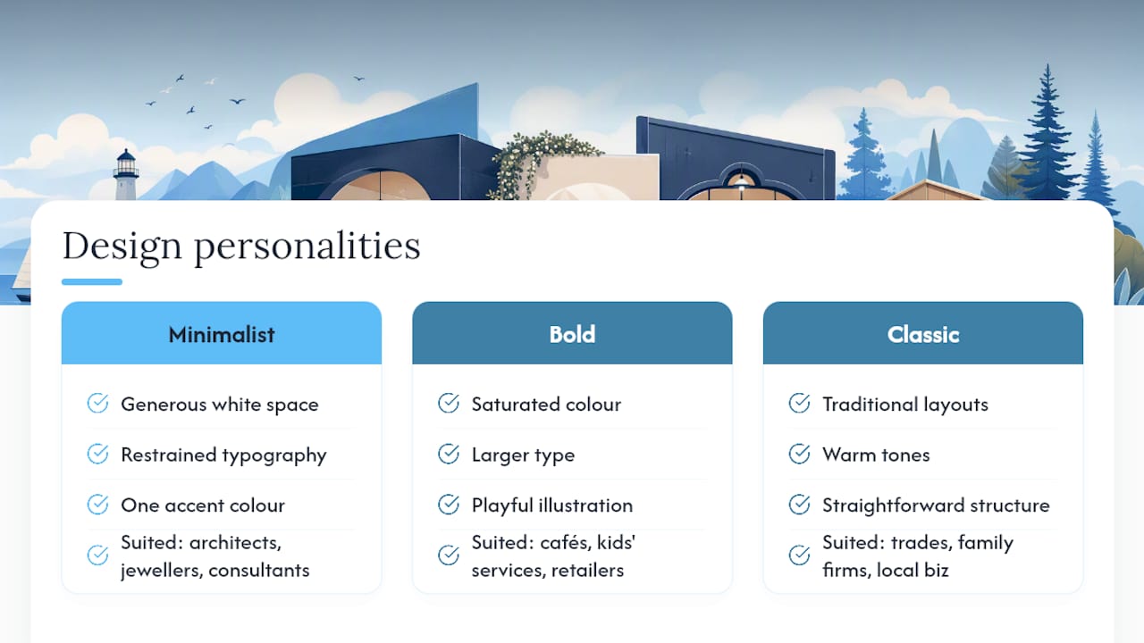
Style should follow brand personality, not the other way round. A minimalist approach, generous white space, restrained typography, one accent colour, suits businesses selling on quality or precision: architects, jewellers, high-end consultants. It signals confidence without shouting, but it demands genuinely strong photography, because there’s nowhere else for the eye to go.
A bolder approach, saturated colour, larger type, more playful illustration, suits brands built on personality and approachability: cafés, children’s services, independent retailers. Jax Snacks is a useful reference point here: loud visual identity, but the checkout and navigation stay simple underneath the noise.
A classic approach, traditional layouts, warm tones, straightforward structure, still works well for trades and long-established local businesses where the reassurance of familiarity matters more than novelty. Think a family-run solicitor’s firm or a third-generation joinery business: the visual message is “we’ve been doing this properly for decades,” and a wildly experimental layout would actually undercut that message.
None of these styles is inherently more effective than the others. The mistake is choosing a style because it’s trending rather than because it matches what your customers are actually looking for when they land on your page.
Keeping a small business website effective after launch
A launch is the start of the work, not the end of it. Sites that were genuinely well designed a year ago often underperform today simply because nobody’s touched them since.
Set a simple cadence: check load speed every few months, since added images and plugins creep in and slow pages down gradually rather than all at once. Refresh photography at least once a year, particularly if it features your team, so returning visitors see a business that’s actively running rather than one frozen in time. Update service pages and pricing the moment anything changes; nothing erodes trust faster than a visitor discovering your website quoted last year’s rates.
Review your contact forms and booking flows every couple of months by actually submitting one yourself. Broken forms fail silently, and you often won’t know leads are vanishing until someone mentions they “tried to get in touch but nothing happened.”
Finally, treat your website as a living document tied to what’s actually converting, not a project you finished once and can now ignore.
Measuring whether your website design is actually working
Design opinions are cheap. The metrics that tell you whether a design is genuinely working are not.
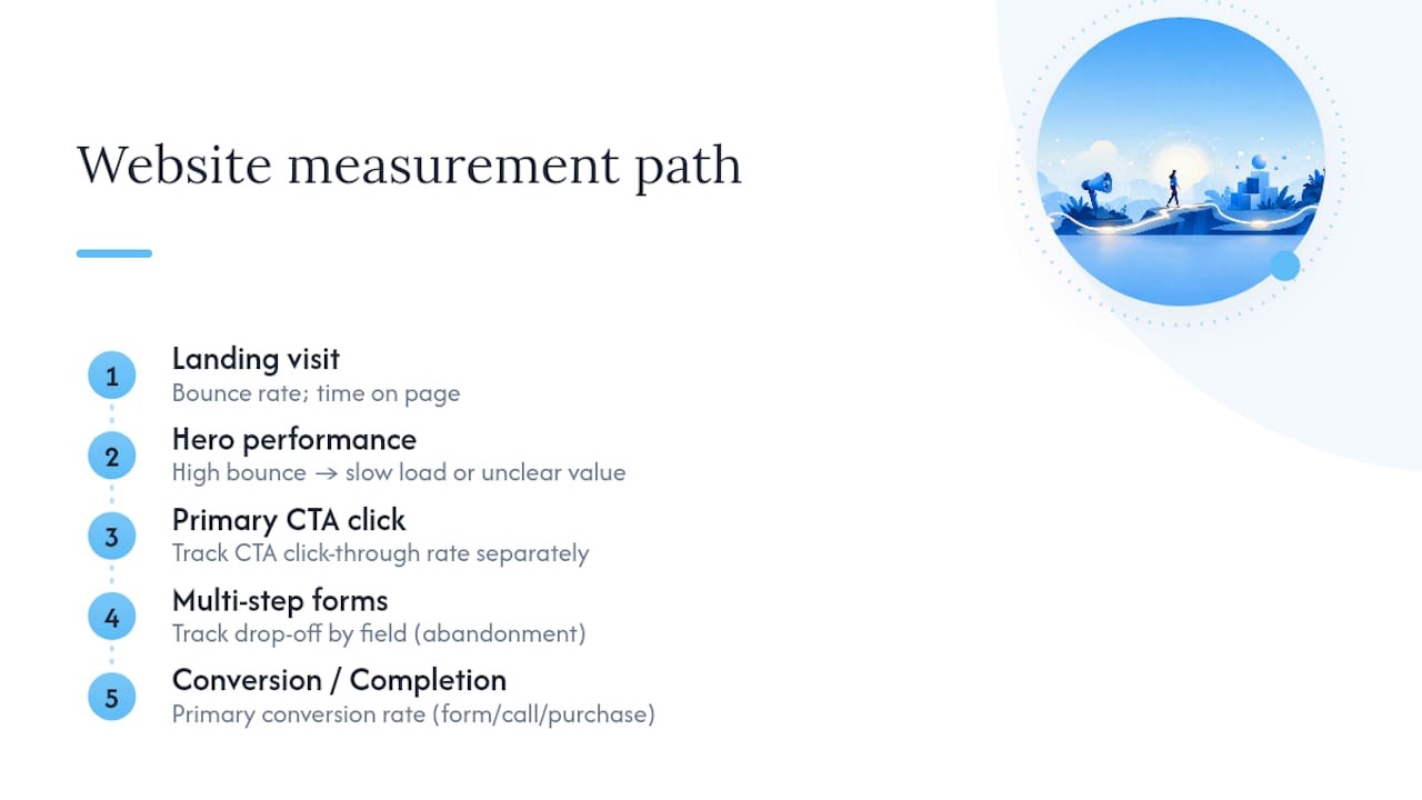
Start with your conversion rate, the percentage of visitors who complete your primary action, whether that’s a form submission, a call, or a purchase. This number matters more than total traffic, because a smaller number of visitors converting well beats a large number bouncing straight off your homepage.
Bounce rate and time on page tell you whether your hero section is doing its job. A high bounce rate on your homepage, especially from mobile visitors, usually points to a slow load time or a value proposition that isn’t clear fast enough.
Click-through rate on your primary CTA button is worth tracking in isolation. If plenty of people land on the page but few ever click your main button, the problem often isn’t your traffic, it’s your offer or its visibility.
Finally, track where drop-off happens in multi-step processes like booking forms or checkouts. A form that loses half its starters at the phone number field is telling you something specific and fixable, far more useful than a vague sense that “the site could convert better.”
TTOY Digital’s approach to building sites that convert
Our own web builds start from the same principle running through every example above: mobile-first, conversion-led, and stripped of anything that doesn’t earn its place on the page. We pair that with SmartFlowCRM, which pulls WhatsApp, email, and web enquiries into a single view, so the leads a well-designed site generates don’t get lost in someone’s inbox. Client results and Chris’s full background sit on our case studies page.
— Chris
Want your own site to look like these small business website examples?
Building a site that looks like the examples above takes more than choosing a nice template, it takes someone who understands why each element earns its place, from the hero CTA to the booking flow underneath it. That’s the gap TTOY Digital fills for small businesses across Derbyshire, South Yorkshire, and Nottinghamshire: a mobile-first build designed around your actual customer journey, not a generic template stretched to fit. Unlike a DIY builder, you get a site briefed around your business from day one, with SmartFlowCRM built in so enquiries from WhatsApp, email, and your contact form land in one place instead of three. If any of the examples above sparked an idea for your own business, our web design service is the place to start that conversation, and you can review our full range of services if SEO or CRM setup are on your list too.
Sources
- The importance of corporate lifestyle photography (2025)
- 10 best business website designs for new companies
- Framer Blog: 15 small business website examples for design inspiration in 2026
- Small Business Websites: 50+ Inspiring Examples (2026)
- 10 Best Home Service Websites: Examples & improvement tips
FAQ
What website is best for small businesses?
There’s no single “best” platform, it depends on budget and complexity, but the strongest small business sites share the same traits regardless of platform: a clear hero CTA, real photography, and a simple lead-capture flow suited to the business.
How do I set up a website for my small business?
Start by deciding your primary conversion goal, then build the core pages, hero, services or products, social proof, and contact or booking, before adding anything extra; a page-builder suits a fast DIY launch, while an agency build suits more complex needs like custom booking systems or CRM integration.
What are 10 examples of small business websites?
Live examples worth studying include Hungry Tiger, AYVAN, and Jax Snacks for ecommerce and brand storytelling, alongside the broader collections at Framer, Webflow, and SiteBuilderReport, which each feature dozens of additional sites across trades, services, and portfolios.
Can you give me an example of a business website?
Hungry Tiger is a good example: a food and drink brand using bold photography and a straightforward product grid to move visitors from browsing to buying within a couple of clicks, a pattern Webflow highlights specifically for its clarity.