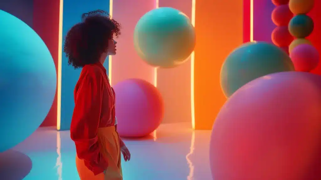
How Color Influences Website Conversion Rates
Are you struggling to improve your website conversions? Understanding how colour impacts your landing page can transform your website design and boost user engagement. Research shows that colours can evoke emotions in the brain, influencing consumer behaviour and decisions. In this article, we will explore how colour choices affect website conversions, the role of colour in branding, and effective strategies for optimising your call-to-action buttons. By the end, you’ll learn how to leverage colour psychology to enhance your website’s performance and ultimately increase sales.
Key Takeaways
- Understanding colour psychology can significantly impact user engagement and conversion rates
- Strategic colour choices enhance readability and guide visitors towards important actions
- Cultural perceptions of colour influence user interactions with your brand
- Consistent colour use across your site builds trust and brand recognition
- Testing different colour schemes helps optimise user experience and drive conversions
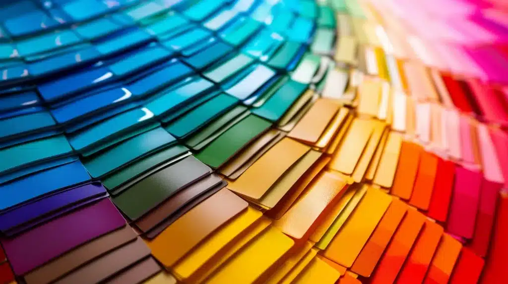
Understanding Colour Psychology in Web Design

When designing your website, understanding colour psychology is essential. The colors you choose impact readability and how visitors perceive your brand‘s reputation. For instance, contrasting colors can enhance text visibility, making it easier for users to engage with your content.
Different colors evoke varying emotions and reactions across audiences. For example, blue often represents trust, while red can stimulate excitement. Recognising these associations allows you to tailor your site’s appeal to match the emotional response you aim to achieve from visitors.
It’s also important to consider how gender influences color perception. Studies show that men and women may respond differently to specific hues, which can affect overall conversion rates. By understanding these nuances, you can create a website that resonates more effectively with your target audience.
Lastly, take into account the challenges posed by colour blindness. A significant portion of the population may have difficulty distinguishing certain colors, which can affect their experience on your website. Designing with accessibility in mind not only improves usability but also reflects positively on your brand‘s reputation.
Colour shapes more than just design. It touches the heart and drives choices, guiding us into the next part of our journey.
The Impact of Colour on Emotions and Consumer Behaviour
Color plays a significant role in user experience design by drawing attention to essential elements on your website. Strategic use of vibrant hues can highlight calls to action, guiding visitors toward completing desired tasks, such as making a purchase or signing up for a newsletter. This targeted approach can directly enhance your conversion rates.
Each color evokes specific feelings that can influence how visitors react to your campaigns. For example, warm tones like red and orange often create a sense of urgency, encouraging quick decision-making. On the other hand, cooler colors like blue promote calmness and trust, which can support longer engagement periods on your site.
Understanding color psychology enables you to craft a website that truly resonates with your audience. When you align your color choices with the emotions you want to elicit, you can create a more compelling experience that keeps visitors engaged and leads to higher conversion rates. Being mindful of these emotional connections can enhance your brand‘s effectiveness.
Incorporating colour into your web design thoughtfully can significantly impact user perception.
By considering how different colors affect feelings and behaviours, you can tailor your website to better meet the needs of your audience. This alignment fosters a positive user experience and can result in increased engagement and conversions for your business.
The way we feel about colours can guide our choices. Next, let’s explore how these choices influence whether visitors stay on your website or click away.
How Colour Choices Affect Website Conversion Rates
Your choice of colors can significantly impact your website’s conversion rates. Complementary colours can draw attention to key elements, such as calls to action, making it easier for visitors to complete desired actions like purchases or subscriptions.
By strategically using these color combinations, you enhance the likelihood of user engagement.
The mood that different colours evoke plays a crucial role in user decision-making. For instance, warm tones can create a sense of urgency, which is beneficial in retail environments where you want customers to act quickly.
A well-thought-out colour scheme can positively influence customers’ interactions with your brand.
Colors also affect memory, influencing how customers recall their experiences with your site. A consistent color palette helps reinforce your brand identity, ensuring that visitors remember your offerings long after their visit. This familiarity can translate into repeat visits and increased conversion rates.
As a web developer, understanding these nuances can inform your design choices to optimise user experience. By aligning your color strategy with the psychological impacts on consumers, you create a more compelling website that not only retains interest but also drives sales effectively.
Your attention to these details can set your site apart in a competitive market.
Choices in colour can bring customers in or send them away. Now, let’s look at how these same colours build brands and shape trust.
The Role of Colour in Branding and Consumer Trust
Colour choices in your web design play a critical role in shaping your brand identity and influencing consumer trust.
Specific hues can convey femininity or masculinity, depending on how they are used. By understanding how these associations work, you can craft a more tailored digital marketing approach that resonates with your target audience.
Trust is a key element in driving conversions, and colour significantly impacts this perception. For example, blue often evokes feelings of reliability and security, making it an excellent choice for brands that aim to establish trust. When your website fosters a sense of confidence, visitors are more likely to engage and convert.
The behaviour of users is also influenced by colour psychology in your branding.
Consumers often associate certain colours with particular emotions or values, which can dictate their reactions to your offerings. By aligning your colour palette with the qualities you wish to convey, you can encourage desired behaviours among your visitors.
Incorporating thoughtful colour strategies not only strengthens brand recognition but also enhances the overall user experience. By creating a cohesive design that reflects your values and appeals to your audience’s emotions, you can build lasting relationships with customers. This approach ultimately leads to improved conversion rates and brand loyalty.
Choosing the right shade can draw customers in, capturing their attention when it matters most. Next, let’s see how colour can make your call-to-action buttons stand out and drive action from your audience.
Optimising Call-to-Action Buttons Through Colour Selection
Your choice of colour for call-to-action (CTA) buttons directly impacts your website’s conversion rates. Understanding how different hues influence user behaviour can enhance your marketing strategy significantly, leading to a more effective customer experience.
Using contrasting colours for your CTAs can make them stand out, encouraging visitors to engage with your buttons. For instance, a bright red or green button on a neutral background may capture attention more readily, prompting users to sign up for your newsletter or make a purchase.
Each colour evokes distinct emotions; therefore, selecting the appropriate shade for your CTAs can influence how visitors respond.
For example, blue often denotes trust, while orange can create a sense of urgency, affirming how essential it is to incorporate colour knowledge into your design choices.
To optimise your CTAs, consider A/B testing different colours and tracking which options lead to higher conversion rates. This data-driven approach allows you to refine your marketing strategy over time and create a website that resonates with your target audience:
| Colour | Emotion | Suggested Action |
|---|---|---|
| Red | Urgency | Encourage quick decisions |
| Green | Safety | Inspire confidence in purchases |
| Blue | Trust | Promote registrations |
| Orange | Excitement | Boost newsletter sign-ups |
The right colours can spark action, but the contrast matters just as much. Brightness and contrast can draw the eye and guide your choices, shaping how users engage with your site.
The Effects of Colour Contrast and Brightness on User Engagement

Colour contrast plays a vital role in enhancing user engagement on your web page. Research shows that high contrast between text and background increases readability, leading to longer visits and improved conversion rates. By ensuring clear visibility, you can more effectively capture the attention of visitors’ minds.
Brightness also affects how users interact with your website. Studies indicate that brighter elements typically evoke emotions related to energy and optimism. This influence can be powerful on social media platforms, where first impressions matter significantly in retaining user interest.
Your audience’s preference for certain colours based on contrast and brightness should guide your design choices. Users are more likely to engage with content that is visually appealing and easy to navigate. When you align your colour strategy with their expectations, it can result in a more compelling user experience.
Consider these pivotal factors when designing your web pages:
- Ensure adequate contrast between foreground and background colours.
- Utilise brightness to evoke positive user emotions.
- Take audience preferences into account for better engagement.
- Monitor performance through user feedback on social media.
While brightness and contrast can draw attention, culture adds another layer to how we perceive colour. Understanding these cultural connections can significantly affect conversion rates in unexpected ways.
Cultural Influences on Colour Perception and Conversion Rates

Cultural influences shape how your audience perceives colours, significantly impacting their interaction with your brand. For example, in some cultures, white represents purity, while in others, it signifies mourning. Understanding these cultural associations can guide your color choices, helping to create a positive user experience and enhance usability.
The human brain processes colours differently based on cultural backgrounds, which can influence conversion rates. A colour perceived as vibrant and inviting in one context might be seen as overwhelming in another. Recognising these variations enables you to tailor your website design to resonate with diverse audiences, ultimately improving engagement.
In the food industry, colour selection often reflects cultural preferences, influencing customers’ decisions. Red might stimulate appetite and excitement, while green signals freshness and health. By integrating these colour strategies into your offerings, you can foster emotional connections that lead to increased conversions.
By accounting for cultural influences on colour perception, you optimise your brand‘s impact. Adapting your website’s colour scheme to align with users‘ feelings can enhance their overall experience. This thoughtful approach has the potential to transform casual visitors into loyal customers:
| Culture | Colour Meaning | Implication for Brand |
|---|---|---|
| Western | White – Purity | Use for clean, trust-focused designs |
| Eastern | White – Mourning | Avoid for sensitive topics |
| Chinese | Red – Good Fortune | Incorporate for celebratory offerings |
| Brazilian | Green – Nature | Highlight eco-friendly products |
Cultures shape how we see colours, affecting choices and buying habits. To truly harness this power, maintaining colour consistency can lead to better conversion performance.
Ensuring Colour Consistency for Enhanced Conversion Performance
Maintaining colour consistency across your website is essential for enhancing website conversion. When visitors encounter a cohesive colour palette, they can better recognise and engage with your brand. This consistency builds brand awareness and fosters trust, both of which are crucial for increasing conversion rates.
Different cultures perceive colours uniquely, making it vital to ensure consistent colour usage that resonates with your audience. By aligning your colour choices with cultural meanings, you can enhance your connection with potential customers. This tailored approach not only optimises user experience but also drives website conversion by aligning with your visitors’ expectations.
Another reason to focus on colour consistency is its impact on memory. A well-defined colour scheme helps your brand stand out in visitors’ minds, making it easier for them to recall their experiences on your site. This familiarity encourages repeat visits and can lead to higher conversion rates over time.
In conclusion, prioritising colour consistency improves your site’s overall effectiveness. By presenting a unified brand identity, you enhance user interaction and satisfaction, ultimately boosting conversions:
- Enhances brand awareness through cohesion.
- Aligns colour choices with cultural perceptions.
- Improves memory retention of your brand.
- Encourages repeat visits and conversions.
You’ve learned how colour consistency can drive better conversions. Now, it’s time to uncover effective strategies that harness the power of colour psychology to elevate your results.
Effective Strategies for Leveraging Colour Psychology to Boost Conversions
To improve conversion rate optimisation, you should carefully select colours that align with your brand‘s message. For example, using calming hues like blue can help reduce tension in users, while brighter colours can stimulate excitement, thus influencing their heart rate and overall engagement with the site. Your typography also plays a crucial role when paired with colour choices. Ensuring that your text contrasts well with background colours enhances readability, making it easier for users to absorb information and take action on your site, leading to a higher conversion rate.
Understanding the impact of colour vision is vital in designing a user-friendly experience. For those with colour blindness, choosing accessible colour combinations can prevent confusion and frustration, ultimately fostering a more inclusive environment that encourages conversions.
Additionally, it’s important to recognise how different colours can evoke feelings of aggression or urgency. Using red strategically can increase the sense of urgency during promotions, prompting quicker decisions and positively impacting your overall conversion rates.
You’ve seen how colour influences choices and shapes emotions. Now, let’s tackle some questions that often arise about how colour truly impacts conversion rates.
Frequently Asked Questions About Colour and Conversion Rates
Understanding how color impacts conversion rates can elevate your website’s performance. You will learn which colors boost conversions, how colour psychology differs based on your audience, and whether testing various color schemes can lower your bounce rate. Explore effective color combinations and discover how to use color to instil confidence and dependability in your user experience.
What Are the Best Colours for Increasing Conversions?
When aiming to increase conversions, certain hues can create a positive impact. For instance, blue is often linked to trust and reliability, making it an ideal choice for businesses that want to instil confidence in potential customers. On the other hand, warmer colours like red can create urgency, which might encourage quick decisions, especially in sales or promotional contexts. Understanding how different colour schemes resonate with your audience can help you craft a visual identity that supports your brand‘s goals.
Additionally, achieving harmony in your website’s design is crucial. When colours complement each other, they can create a cohesive atmosphere that enhances user experience, reducing feelings of sadness or confusion often associated with mismatched designs. By strategically incorporating these insights into your colour choices, you create an inviting environment that encourages engagement and boosts your conversion rates significantly.
How Does Colour Psychology Vary by Target Audience?
Colour psychology can vary widely depending on your target audience, as different demographics may respond uniquely to graphics and colour choices. For instance, younger audiences often favour vibrant and energetic hues that evoke a sense of happiness, while older demographics might prefer more muted tones that convey professionalism and reliability. Recognising these variations can guide you in crafting a website that better meets the preferences and expectations of your visitors.
To achieve a sense of balance in your colour strategy, it is essential to consider cultural influences and individual preferences within your audience. For example, an infographic featuring warm colours may resonate well with audiences in industries like food and entertainment, as these colours often stimulate excitement. In contrast, using cooler colours could be more effective for sectors such as finance or healthcare, where trust is paramount:
| Audience Demographic | Preferred Colour Scheme | Emotional Response |
|---|---|---|
| Young Adults | Bright and Vibrant | Happiness and Energy |
| Older Adults | Muted and Professional | Trust and Stability |
| Food Industry | Warm and Inviting | Excitement and Hunger |
| Finance Sector | Cool and Calm | Security and Trust |
Can Testing Different Colour Schemes Improve Conversion Rates?
Testing different colour schemes can significantly enhance your website’s conversion rates by optimising navigation and improving visibility for key elements. For example, using contrasting colours for calls to action can guide users to “skip to content” that matters most, effectively increasing the likelihood of engagement. By selecting shades that resonate with emotions like optimism or appetite, you can create an inviting environment that encourages users to interact with your offerings.
By experimenting with various colour combinations, you gain valuable insights into how specific hues affect user behaviour. If test results show that a particular colour scheme leads to longer session durations or higher click-through rates, it becomes clear that these changes can make a tangible difference in your site’s performance. Adapting your design based on these findings allows you to create a user experience that drives conversions while aligning with your audience’s expectations.
What Colour Combinations Are Most Effective for Conversion?
When considering effective colour combinations for conversion, think about the balance between energy and sophistication. For instance, using vibrant colours like orange or green alongside neutral shades can create a visually appealing hierarchy that draws users’ attention to key calls to action. This mix not only communicates urgency but also prompts consumers to engage, making specific actions stand out on your site.
Integrating colours that evoke emotional responses can significantly influence consumer behaviour. Pairing a calming blue with energetic yellow can enhance trust while motivating users to take action. This strategic approach not only reflects a sophisticated design but also improves overall user experience, making it easier for visitors to navigate your website and convert effectively.
How to Use Colour to Create a Compelling User Experience?
To create a compelling user experience, consider applying color theory by selecting hues that evoke the desired emotions. For example, using blue can communicate credibility and calmness, making your site feel trustworthy and user-friendly. Incorporating these principles into your interior design can lead to well-thought-out layouts that guide visitors seamlessly through your content.
Pay close attention to the colour of your buttons, as they can significantly impact user interactions. A bright, contrasting button in a colour that aligns with your overall palette can attract attention and encourage clicks. Ensuring that your button stands out while maintaining harmony with your site’s design will enhance usability and engagement:
| Element | Colour Choice | Effect on User Experience |
|---|---|---|
| Background | Cool Blue | Promotes calmness and focus |
| Buttons | Bright Orange | Creates urgency and encourages action |
| Text | Dark Charcoal | Enhances readability and trust |
| Accent Elements | Soft Green | Evokes freshness and vitality |
Conclusion
Understanding how colour influences website conversion rates is vital for creating an engaging user experience. Thoughtful colour selections can evoke specific emotions, guiding visitors towards desired actions and ultimately boosting conversion rates. Consistency in colour usage strengthens brand identity and fosters trust, encouraging repeat visits. By leveraging colour psychology effectively, you can significantly enhance your website’s performance and impact on your audience.