
High-Converting Landing Page Design: How to Boost Lead Generation and Conversion Rates
A high-converting landing page is a focused web page designed to turn visitors into leads or customers by presenting a clear value proposition, a single conversion goal and an optimised user path. This article explains how landing page design, persuasive copy, and conversion rate optimisation (CRO) work together to increase lead capture and sales for small businesses. Readers will learn the essential elements that drive conversion, an iterative CRO process to refine performance, practical design and copy best practices, and SME-focused tactics that maximise commercial return. The guide also showcases concise example patterns and mini case-study comparisons to illustrate measurable improvements, and it closes with clear next steps for engaging bespoke landing page services. Throughout, the focus is on landing page design, lead generation page structure and conversion-focused techniques that produce reliable uplift for small-business funnels.
What Are the Key Elements of a High-Converting Landing Page?
A high-converting landing page brings together headline clarity, a compelling value proposition, a single prominent call-to-action (CTA), trust signals, and a streamlined lead-capture form to reduce friction and increase conversions. These elements work by aligning visitor intent with a clear action path: the headline attracts attention, the value proposition aligns expectations, trust signals reduce perceived risk, and an optimised form captures contact details efficiently. Effective pages also prioritise mobile responsiveness and page speed because faster, mobile-first pages convert more consistently across devices. Understanding these components helps you prioritise design and testing efforts that directly affect conversion rates.
Landing pages must sequence information logically so visitors can decide quickly, which leads into the first micro-element: the CTA and its role in driving action.
This brief checklist highlights the primary elements that form a conversion-focused landing page:
- Clear value proposition: A concise statement explaining the main benefit in one sentence.
- Single, prominent CTA: One action per page to avoid choice paralysis and increase response.
- Trust signals: Testimonials, badges or short stats that reduce friction and build credibility.
- Optimised form: Minimal fields and progressive profiling to maximise completions.
- Mobile responsiveness and speed: Fast load times and touch-friendly layout for mobile users.
These elements map directly to measurable outcomes such as click-through rate, form completion rate and time to first interaction, which we examine next.
Different landing page parts have distinct attributes and KPIs; the table below helps compare them for prioritisation.
| Element | Attribute | Best-Practice / KPI |
|---|---|---|
| Headline | Clarity of offer | Click-through rate to CTA; aim for >20% above baseline |
| Call-to-Action (CTA) | Visual prominence & microcopy | CTA click rate; primary success metric for intent |
| Lead-capture form | Field count & friction | Form completion rate; shorter forms typically lift conversions |
| Trust signals | Type and placement | Conversion lift after adding proof elements; A/B testable |
| Page performance | Load time & mobile layout | Bounce rate and mobile conversion; target sub-3s load |
This comparison clarifies where to focus optimisation: headline and CTA first, followed by form friction and trust elements. The next section examines CTA design in more detail.
How Does a Clear Call-to-Action Improve Conversions?
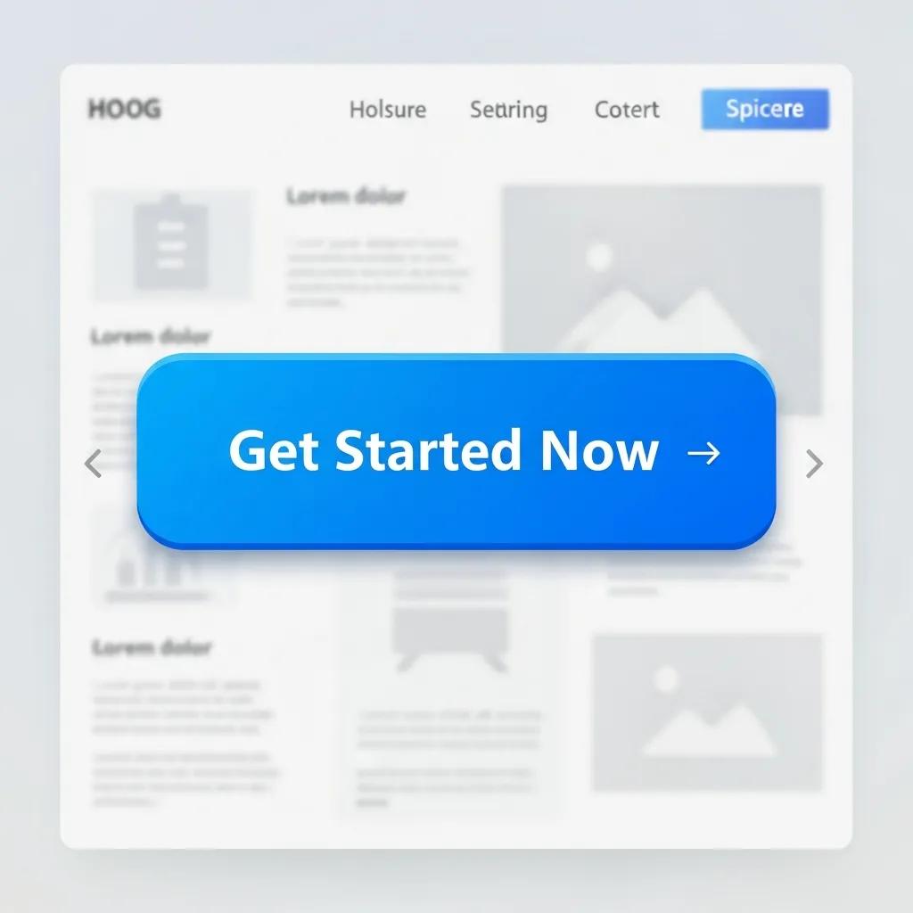
A clear call-to-action improves conversions by signalling a single, obvious next step and reducing cognitive load for the visitor. The mechanism is simple: focused CTAs align user intent with page purpose, which increases both click-through and downstream conversion rates. Effective CTAs combine concise microcopy, strong visual contrast, and strategic placement above the fold or after a concise value statement. To test impact, vary copy and colour in A/B tests and measure changes to CTA click-through rate and subsequent form completion.
Use short dos and don’ts when refining CTA design: keep text action-oriented, avoid multiple CTAs on the same page, and ensure mobile touch targets are large enough. These improvements lead naturally into why trust signals must be paired with CTAs to convert hesitant visitors.
Why Are Trust Signals and Social Proof Essential for Landing Pages?
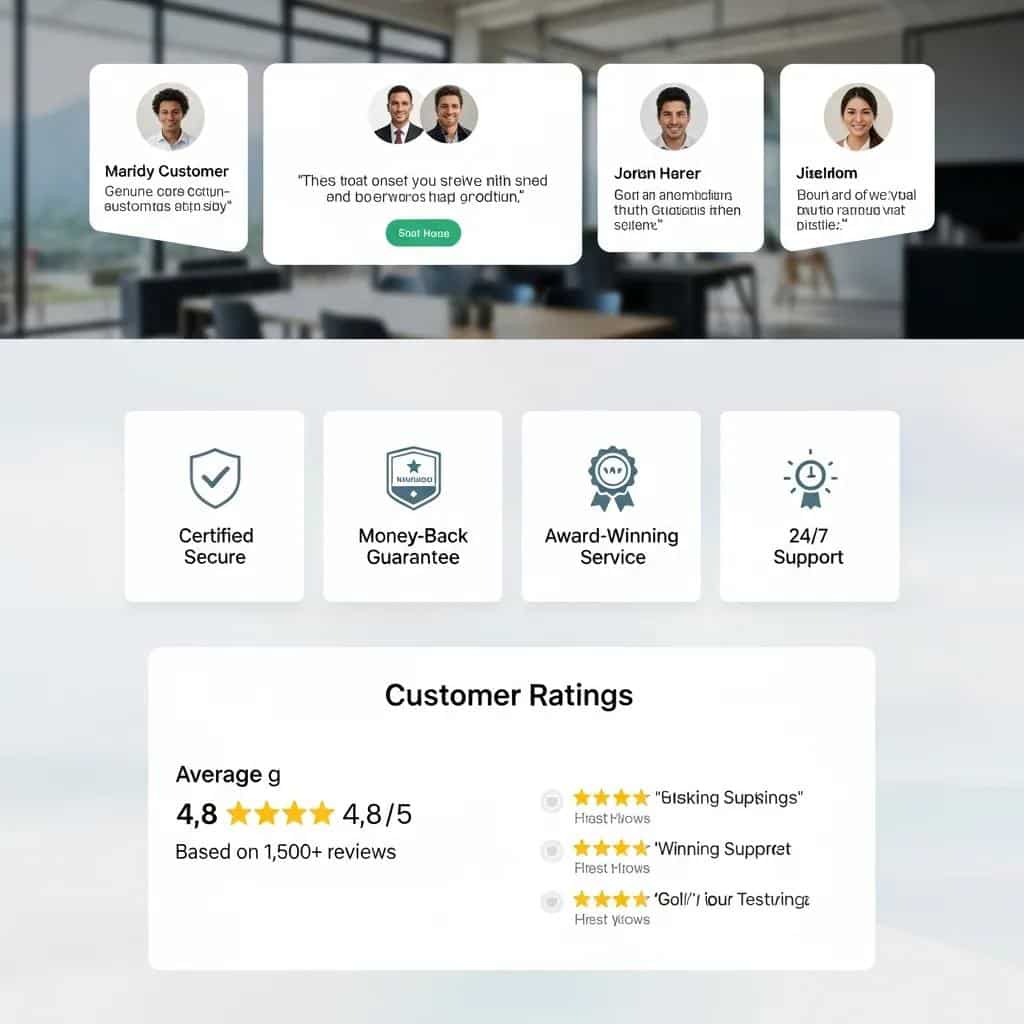
Trust signals and social proof are essential because they reduce perceived risk and speed up decision-making by showing others have benefited from the offer. Mechanistically, testimonials, client logos, short case stats and badges create credibility that complements the value proposition and increases form completions. Place trust signals near the CTA and on long-form pages near decision points to maximise persuasive effect. Test different formats text quotes, customer ratings or short video endorsements to find which format yields the greatest uplift in conversion rate.
Quantify impact by A/B testing pages with and without prominent trust elements and measuring conversion lift; even simple proof items often produce double-digit relative improvements. The next major area covers systematic testing and optimisation to turn these changes into sustained gains.
How Does Conversion Rate Optimisation Enhance Landing Page Performance?
Conversion Rate Optimisation (CRO) is a structured, iterative process that increases landing page effectiveness through hypothesis-driven tests, measurement and implementation. CRO works by identifying friction points with analytics and behavioural tools, formulating hypotheses that target those bottlenecks, testing variations, and applying winning changes to lift conversion metrics. The core benefit is sustained, measurable improvement in lead capture efficiency without necessarily increasing traffic, which improves marketing ROI for small businesses. Prioritising tests by likely impact and implementation effort ensures resources focus on the highest-return changes.
CRO’s iterative nature leads directly into practical A/B testing strategies and sample-size considerations for reliable results.
Below is a compact comparison of common CRO techniques, what they test and the expected impact to help prioritise experiments.
| CRO Technique | What it tests | Expected impact |
|---|---|---|
| A/B testing | One variation vs control | Clear wins on headlines, CTAs and forms; medium-high impact |
| Multivariate testing | Multiple elements combined | Identifies best combinations; high impact but needs traffic |
| Heatmaps & session recordings | Behavioural friction points | Reveals scroll and click patterns; informs test ideas |
| Form optimisation | Field removals/auto-fill | Reduces abandonment; often immediate uplift |
| Personalisation | Tailored content per segment | Improves relevance; high impact for repeat visitors |
This table helps teams choose the right technique based on traffic and resources. Next we explore concrete A/B testing tactics you can apply immediately.
What Are Effective A/B Testing Strategies for Landing Pages?
Effective A/B testing strategies start with a clear hypothesis, a measurable metric and a realistic sample-size and timeline for statistical confidence. Choose variables with high potential impact headline, CTA text and form length and avoid testing trivial changes that won’t move the needle. Use prioritisation frameworks that score tests by effort, traffic and expected impact so you test the highest-return ideas first. Ensure tests run long enough to reach significance while avoiding mid-test changes that invalidate results.
Practical test ideas include headline swaps, alternative CTA microcopy, and reducing form fields; each test should map directly to a KPI such as click-through or conversion rate. The following section explains which analytics metrics and tools best inform these experiments.
How Can Analytics Inform Continuous Landing Page Improvements?
Analytics provide the evidence base for CRO by revealing which pages, segments and interactions underperform and why they do so. Key metrics to monitor include conversion rate, bounce rate, time on page, and funnel drop-off points; combining these with heatmaps and session recordings pinpoints friction. Tools such as analytics platforms and behaviour-capture solutions help translate data into testable hypotheses and prioritised improvements. Use segmentation by traffic source, device and campaign to ensure changes benefit the right audience and to avoid misleading aggregate results.
Turning analytics into action requires forming clear hypotheses from observed behaviour and designing targeted experiments; this analytical loop feeds back into ongoing CRO work and into design choices covered next.
What Are Best Practices for Designing Landing Pages That Generate Leads?
Best practices for lead-generating landing pages combine mobile-first layout, benefits-led copy, visual hierarchy and a friction-minimised form to create a seamless path from visit to conversion. The definition-to-benefit path is simple: good design makes the value obvious, persuasive copy communicates relevance, and technical performance ensures the experience is fast and reliable. Prioritise scannable sections, strong above-the-fold messaging, and progressive disclosure of details so visitors are not overwhelmed. These practices reduce bounce and improve lead capture efficiency for small-business campaigns.
Next we cover mobile-first specifics because the majority of users now interact on phones and tablets.
Here is an actionable checklist of design and copy best practices to apply when building or revising a lead page:
- Mobile-first layout: Design for small screens first to ensure clarity across devices.
- Benefit-led headline: Lead with what the user gains, not product features.
- Visual hierarchy: Use contrast, spacing and typography to guide attention.
- Short, relevant forms: Ask only for essential information to reduce friction.
- Performance optimisation: Compress images and prioritise critical CSS to improve load time.
Applying this checklist improves baseline conversion rates and sets up cleaner experiments for CRO.
How Does Mobile-First Design Impact Landing Page Success?
Mobile-first design impacts success by ensuring the primary conversion path is usable on constrained screens, which increases completion rates for on-the-go visitors. The mechanism is straightforward: touch-friendly CTAs, single-column layouts and reduced visual clutter speed decision-making and reduce friction on mobile. Practical tactics include placing CTAs within thumb reach, minimising on-screen form fields and optimising images for faster loading. Performance targets such as sub-3-second load times and responsive layout checks help maintain a high-quality mobile experience.
Design choices for mobile feed directly into persuasive copy decisions that clarify value with minimal reading.
What Role Does Persuasive Copywriting Play in Lead Generation?
Persuasive copywriting plays a central role by translating product features into benefits that resonate with visitor intent and motivate action. Copy that leads with customer outcomes, uses concise language and includes clear microcopy on forms reduces uncertainty and increases conversions. Apply headline formulas that combine benefit, timeframe and specificity, then follow with short bullet-level proof points to aid scanning. Test variations of benefit statements and microcopy for measurable lifts in CTA engagement and form completion.
Good copy and design together create a coherent message that drives visitors toward the next section: sales-focused page tips for small businesses.
Which Landing Page Design Tips Help Small Businesses Maximise Sales?
Small businesses maximise sales by aligning the landing page offer with the customer’s funnel stage, reducing choice friction and using low-friction lead magnets to capture interest quickly. The core mechanism is to match page intent to visitor intent: purchase-intent visitors see price and guarantees, awareness-stage visitors receive helpful lead magnets or demos. Keep offers clear, present price and delivery information transparently, and provide easy ways to ask questions or proceed to purchase. These tactics reduce abandonment and improve conversion value for small business pages.
Below are practical tips tailored to small-business constraints and priorities.
- Align CTA with next funnel step: Make the CTA reflect the precise action the user wants to take.
- Reduce choices: Limit options per page to prevent paralysis and increase decisive action.
- Use low-friction lead magnets: Short guides, demos or trial offers work well for initial capture.
- Be transparent on price and terms: Clear pricing reduces hesitation for purchase-focused pages.
Implementing these tips sets the stage for sales page design and media choices discussed next.
How Can Sales Page Design Boost Conversion Rates?
Sales page design boosts conversion by structuring content around purchase intent: prominent price, clear value justification, social proof and a risk-reduction element such as a guarantee. Sales pages differ from lead pages by focusing on transaction details, trust signals that validate purchase, and a checkout-friendly CTA. Use above-the-fold pricing and a persuasive product narrative that anticipates objections and answers them succinctly. Elements like clear returns policy statements and concise FAQ snippets reduce friction and increase final purchase conversion.
Well-structured sales pages often benefit from targeted CRO experiments focused on pricing presentation and guarantee wording.
What Visual and Multimedia Elements Increase User Engagement?
Visual and multimedia elements increase engagement when they clarify product benefits and reduce cognitive load without harming performance. Use short explainer videos, annotated screenshots, and demo GIFs to demonstrate value quickly; select formats based on context—video for demonstration, images for credibility. Optimise media for web by compressing files, deferring non-critical assets and using responsive formats to preserve speed. When deployed thoughtfully, multimedia increases time on page and conversion intent, particularly for complex products or services that benefit from demonstration.
These media choices inform example designs shown next, where we look at real-world landing page examples and their lessons.
What Are Effective Lead Generation Landing Page Examples for Small Businesses?
Effective lead generation examples share common interventions: clearer headlines, streamlined forms, stronger trust signals and mobile speed improvements that together produce measurable uplifts. In practice, small-business pages that moved from multi-CTA homepages to single-purpose landing pages frequently saw improved lead capture efficiency. The benefit is that these targeted pages reduce visitor decision time and increase the conversion probability for specific campaigns. Studying concise before/after patterns helps teams replicate successful changes while tailoring to their audience.
The table below summarises compact example types, the change implemented and the typical conversion improvement pattern to guide prioritisation.
| Example / Client Type | Change Implemented | Conversion Improvement |
|---|---|---|
| Local service provider | Single-purpose landing page with one CTA | Notable double-digit conversion uplift |
| B2B lead magnet campaign | Short form + gated guide | Higher lead quality and increased form completions |
| E-commerce promo | Simplified checkout CTA + price clarity | Reduced cart abandonment and faster purchases |
These patterns indicate which interventions to try first: simplify intent, reduce form friction, and add trust proof. After reviewing examples, many readers want to see how an agency applies these methods in practice.
TTOY Digital’s approach illustrates how a bespoke, conversion-focused design process translates best practices into live pages for small businesses. TTOY Digital provides affordable websites for small businesses and combines bespoke landing page design with conversion optimisation and friendly client support, using cutting-edge digital tools to deliver tailored outcomes. Small-business owners can review the agency’s “Our Work” case studies for contextualised examples of these interventions and their outcomes.
How Do Real Case Studies Demonstrate Conversion Improvements?
Real case studies demonstrate conversion improvements by presenting a baseline metric, the interventions applied and the resulting uplift over a defined period. The mechanism is transparent: baseline measurement identifies the problem, targeted changes address specific friction, and follow-up measurement confirms impact. Case summaries commonly highlight headline rewrites, form reductions and added trust signals as quick wins that produce measurable results. Presenting these in a concise problem-solution-results format makes it easier for small businesses to map similar changes to their pages.
Analysing case studies leads to practical lessons that teams can replicate, which we summarise next.
What Lessons Can Be Learned from Successful Landing Pages?
Successful landing pages consistently teach three main lessons: focus on a single conversion goal, test and measure each change, and optimise for mobile performance first. The reason these recur is that clarity removes decision friction, testing converts guesses into evidence, and mobile optimisation captures the growing share of on-device visitors. Implementing a repeatable process benchmark, hypothesise, test, and implement- helps small businesses turn improvements into predictable gains. Prioritise low-effort, high-impact fixes such as CTA clarity and form reductions before investing in heavier design overhauls.
These lessons form the basis for getting started with a professional design engagement, as explained in the next section.
How Can You Get Started with High-Converting Landing Page Design Services?
Getting started with high-converting landing page design services begins with an initial audit and discovery to establish goals, baseline metrics and target audience segments. The process then moves to a strategy proposal, rapid prototype or wireframe, and iterative testing paired with analytics to validate improvements. Typical deliverables include a conversion-focused landing page, tracking setup and a CRO roadmap for ongoing optimisation. For small businesses, an initial audit and a short optimisation plan provide a quick path to measurable uplift without committing to high upfront costs.
Below is a clear step sequence you can follow to engage a provider and prepare for an effective project.
- Request an initial audit: Gather baseline metrics and identify priority friction points.
- Share key inputs: Provide current website, business goals and target audience details.
- Review a proposed roadmap: Agree on deliverables, timeline and measurable KPIs.
- Begin iterative testing: Implement priority changes and measure performance.
These steps prepare you for a smooth engagement and lead directly into why some providers, including local SME-focused agencies, are a good fit.
Why Choose TTOY Digital for Bespoke Landing Page Design?
TTOY Digital positions itself as an award-winning web design and digital marketing agency focused on small businesses, offering affordable websites and outstanding, friendly support. Our methodology pairs bespoke web design, built for conversion with CRO and practical CRM integration to capture and nurture leads effectively. TTOY Digital emphasises using cutting-edge digital tools and top-notch customer care to deliver tailored outcomes. For Derbyshire-based small businesses seeking a local partner, we offer free consultations.
Understanding what to prepare makes the booking process faster, which we explain below.
What Are the Next Steps to Book a Consultation or Get a Free Marketing Report?
To book a consultation or request a free marketing report, prepare basic inputs such as your current website URL, primary business goals, target audience profile and any existing conversion metrics you can share. During the consultation, you should expect an audit overview, tailored recommendations and a proposed timeline for prototype and testing phases. Typical turnaround for the initial report and audit summary varies, but clear inputs accelerate the process and help prioritise the first round of CRO experiments. Requesting a free marketing report provides an evidence-led way to understand opportunities before committing to a full project.
Start by assembling those materials and scheduling an audit conversation to convert insight into action and continuous optimisation.